
The supplies we were given were from a line called Paradise by Little Yellow Bicycle. I love Little Yellow Bicycle! When Emma showed us the line we would be using for this project, my mind instantly started working. I initially thought that the line was quite feminine. I have a 3-year old boy...what was I going to do with feminine paper?
Our instructions were to use the papers and embellishments and we had to use the March sketch from the 2012 PageMaps calendar as inspiration. Emma gave us an additional challenge: create your own flower.
Here is what I came up with:

Full disclosure: I am a simple scrapbooker. I like clean layouts with a few embellishments but nothing incredibly fancy.
For this layout, I used all the supplies I received from Emma, except for the brads, the die cut shape used for the title background, the letter stickers, the ribbons, the ink and the floss (all from my personal stash). I like to start my layouts on a piece of cardstock, which is what I did here. I used Bazzill cardstock aka my favourite cardstock. Next, I glued down two of the patterned papers so that they covered most of the page. I decided that I needed to place my pictures on a more muted paper so I used the blue-ish paper given to me. I distressed the edge of the paper and used Tim Holtz Distress Ink in Tea Dye to ink it. I layered on top of the blue paper with the brown polka-dots paper. Next, I used We R Memory Keepers Sew Easy to sew on my page. Because I was sewing through a few layers of paper, it was a little more time consuming but worth to add some detail.

I then use a file to distress the edges of my pictures. This is one of my favourite techniques. It looks like your pictures are matted without having to do so. I glued them purposely crooked. I also used pop-up tape on the middle picture to add some dimension.
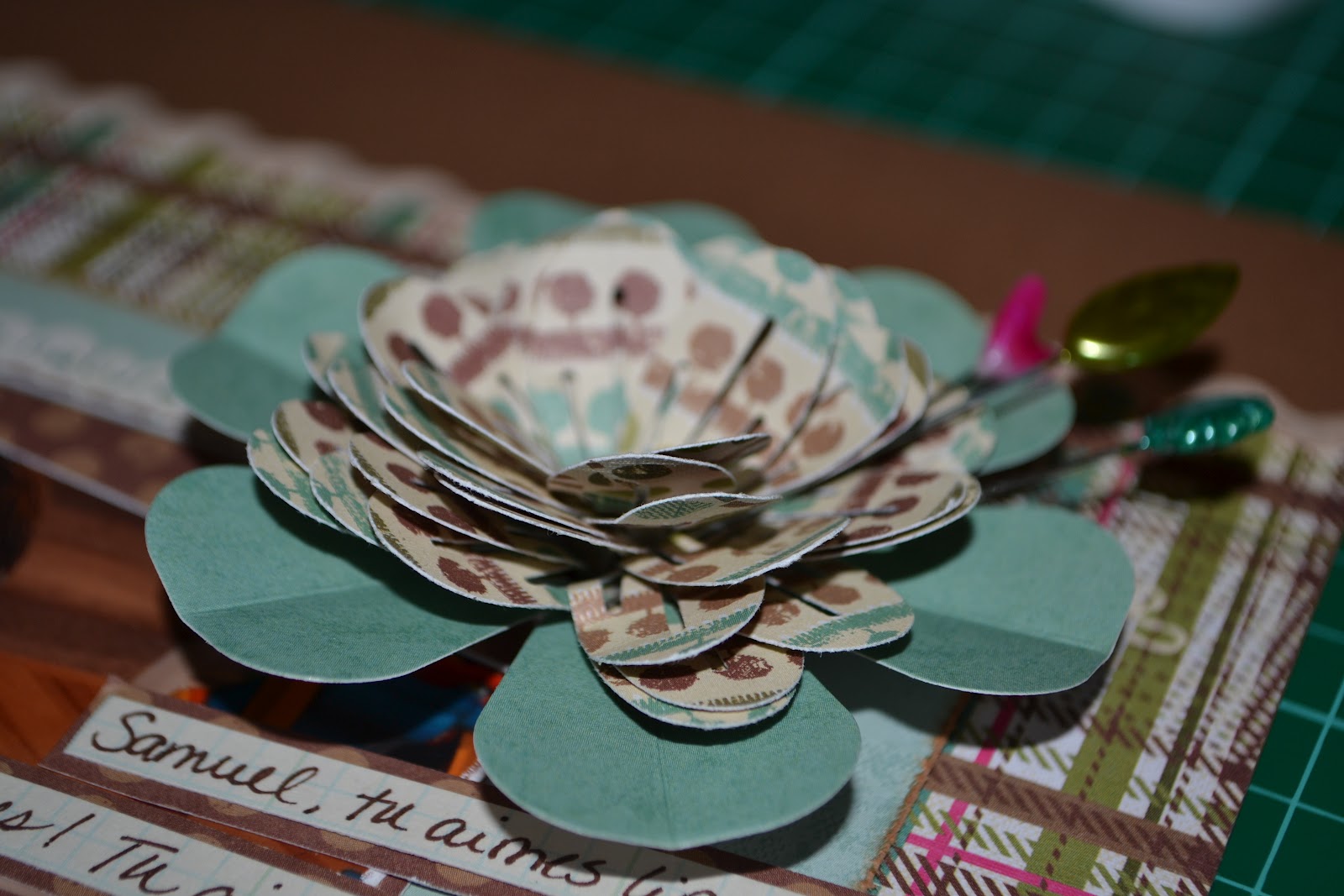
Next, I tackled making my own flower. I used EK Success carnation dimensional flower punch and punched out a 12" stretch of paper. I then rolled it around a pencil and glued it in place. I peeled back the petals and glued the blue flower (provided by Emma) underneath. The final touch was the pins from the line..and VOILÀ!
I then moved on to the title. I felt that the title would get lost on the patterned paper. So, I used a die cut that I had in my stash and used the Tea Dye Distress Ink on the edges. I added letter stickers I also had in my stash. I looked at it and felt it needed a little something more. So, I added flowers and a leaf from the line (brads were from my stash).

The final touches: the ribbon at the top of the page; the white paper glued on the top of the brown polka-dot paper (I used a border punch to add pattern); and the journalling.
Here is a list of all the products I used (as far as I can remember!):
EK Success border punch
EK Success dimensional flower punch
Tea Dye Distress Ink
Sew Easy (We R Memory Keepers) floss, needle and stitch piercer
Beige ribbons
File
Edge distresser
Creative Memories letter stickers
Cooper brads
Brown cardstock
Brown pen
Pop-up tape
I can't wait to tackle next month's design team project!

No comments:
Post a Comment